PL-300: Microsoft Power BI Data Analyst
Question 231
You have a table that contains the following three columns:
- City
- Total Sales
- Occupation
You need to create a key influencers visualization as shown in the exhibit.

How should you configure the visualization?
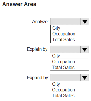
Box 1: Total Sales
Box 2: Occupation
Box 3: City
Total Sales is what we analyze,we explain by occupation and expand by city.
You can use Expand By to add fields you want to use for setting the level of the analysis without looking for new influencers.
Reference:
https://docs.microsoft.com/en-us/power-bi/visuals/power-bi-visualization-influencers
You have the dataset shown in the following exhibit.
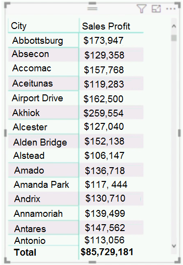
You need to ensure that the visual shows only the 10 cities that have the highest sales profit.
What should you do?
Add a Top N filter to the visual.
Configure the Sales Profit measure to use the RANKX function.
Add a calculated column to the table that uses the TOPN function. In the visual, replace Sales Profit with the calculated column.
Add a calculated column to the table that returns the city name if the city is in the top 10, otherwise the calculated column will return "Not in Top 10". In the visual, replace Sales Profit with the calculated column.
Answer is Add a Top N filter to the visual.
Power BI Top N Filters are useful to display the top performing records, and Bottom N filters are helpful to display the least performing records. For example, we can display top or bottom 10 products by orders or sales.
Note:
1. Select the Column you want to display the Top Sales Profit
2. Then change the Filter Type of that Column to Top N
3. Fill in Top / Bottom number field
4. And lastly drag to the By Value filed your Sales Profit
Incorrect Answers:
B: You would need a filter as well.
Reference:
https://www.tutorialgateway.org/power-bi-top-10-filters/
You have a report page that contains the visuals shown in the following exhibit.

Use the drop-down menus to select the answer choice that completes each statement based on the information presented in the graphic.
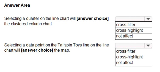
Box 1: not affect
Box 2: cross-filter
Reference:
https://docs.microsoft.com/en-us/power-bi/consumer/end-user-interactions
You plan to create the chart shown in the following exhibit.
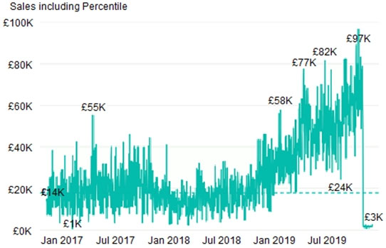
How should you create the dashed horizontal line denoting the 40th percentile of daily sales for the period shown?
Add a measure to the visual that uses the following DAX expression. Measure1 = PERCENTILEX.INC (Sales,Sales[Total Sales],0.40)
Add a new percentile line that uses Total Sales as the measure and 40% as the percentile.
Create a horizontal line that has a fixed value of 24,000.
Add a measure to the visual that uses the following DAX expression. Measure1 = PERCENTILEX.EXC (Sales,Sales[Total Sales],0.40)
Answer is Add a new percentile line that uses Total Sales as the measure and 40% as the percentile.
The analytics feature enables you to show percentiles across groups specified along a specific axis.
Example:
1. Click on the analytics tab
2. Select Percentile
3. You can choose a specific percentile along with other formatting options.
4. Drag a date or non-numeric dimension into the Axis of a column chart
Add percentile lines to monitor daily revenue
Incorrect Answers:
A, D: There are two main percentile functions in Power BI:
PERCENTILE.EXC(column, kth percentile)
PERCENTILE.INC(column, kth percentile)
The first parameter is the column which you want the percentile value for.
The second parameter is the kth percentile where k percentage of values will fall below.
Both formulas use a slightly different algorithm. The second algorithm works for any value of k between 0 and 1 (the 0th and 100th percentile). In the EXC version the data excludes both lower and upper bounds, while INC includes them.
Reference:
https://dash-intel.com/powerbi/statistical_functions_percentile.php
You need to create a visual as shown in the following exhibit.
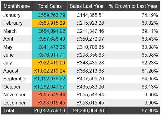
The indicator color for Total Sales will be based on % Growth to Last Year.
The solution must use the existing calculations only.
How should you configure the visual?
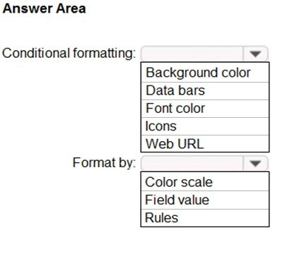
Box 1: Background color To format the Color column based on its field values, select Conditional formatting for the Color field, and then select Background color or Font color.
In the Background color or Font color dialog box, select Field value from the Format by drop-down field.
Box 2: Rules
Reference:
https://docs.microsoft.com/en-us/power-bi/create-reports/desktop-conditional-table-formatting
You have the Power BI data model shown in the following exhibit.
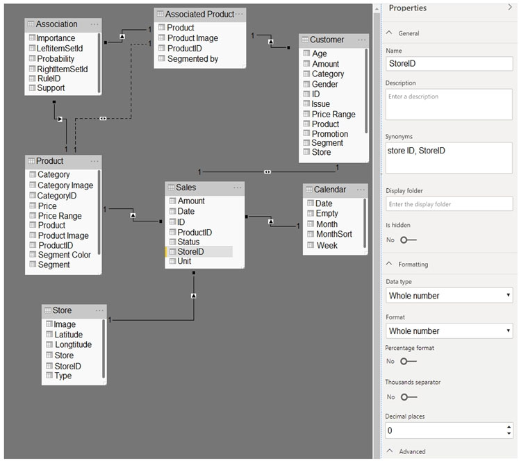 Use the drop-down menus to select the answer choice that completes each statement based on the information presented in the graphic.
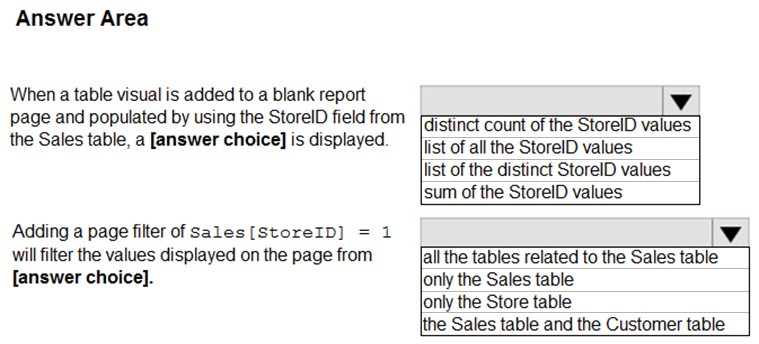
Answer is D and D
What is the row limit when creating R visuals?
100,000 rows
150,000 rows
500,000 rows
1,000,000 rows
Answer is 150,000 rows
R plots are limited to 150,000 rows
You use Power BI Desktop to create a visualization for a Microsoft SQL Server data source.
You need to ensure that you can use R visualization.
Which two actions should you perform?
Download and install Microsoft R Server.
Download and install RStudio Server on the computer that has Power BI Desktop installed.
Install SQL Server R Services on the server that runs SQL Server.
Enable R Scripting on the computer that has Power BI Desktop installed.
Download and install Microsoft R on the computer that has Power BI Desktop installed.
Answers are; D and E
1- download and install R Services
2- specifying local R installation in the R Scripting section of the Options dialog box.
References:
https://docs.microsoft.com/en-us/power-bi/desktop-r-visuals
You need to use Performance Analyzer in Power BI Desktop to review the performance of report elements.
Which two tasks should perform before you start the recording from Performance Analyzer?
Clear the visual cache.
Clear the data engine cache.
Open the Selection pane.
Refresh the dataset.
How does the admin workspace role differ from other types of workspace roles?
Admin is the only role that can publish or update apps.
Admins are the only role that can remove users.
Admin is the only role that can create, edit, or delete content in a workspace.
Admin is the only role that can publish content to a workspace.
Answer is Admins are the only role that can remove users.