PL-300: Microsoft Power BI Data Analyst
Question 211
You need to create a dashboard in the Power BI service to display data from a PubNub source.
What should you do?
Add a Microsoft SQL Server Analysis Services (SSAS) data source that uses Connect live and create a report. Pin the report to a dashboard.
Create an app workspace and publish the workspace to a dashboard.
Add a Microsoft Azure SQL database data source that uses DirectQuery and create a report. Pin the report to a dashboard.
Add a custom streaming data tile to a dashboard.
Answer is Add a custom streaming data tile to a dashboard.
For pubnub data, we can visualize it using data tile on dashboard and configure pubnub as data source.
Reference:
https://docs.microsoft.com/en-us/power-bi/connect-data/service-real-time-streaming#streaming-dataset
You are using the key influencers visual to identify which factors affect the quantity of items sold in an order.
You add the following fields to the Explain By field:
- Customer Country
- Product Category
- Supplier Country
- Sales Employee
- Supplier Name
- Product Name
- Customer City
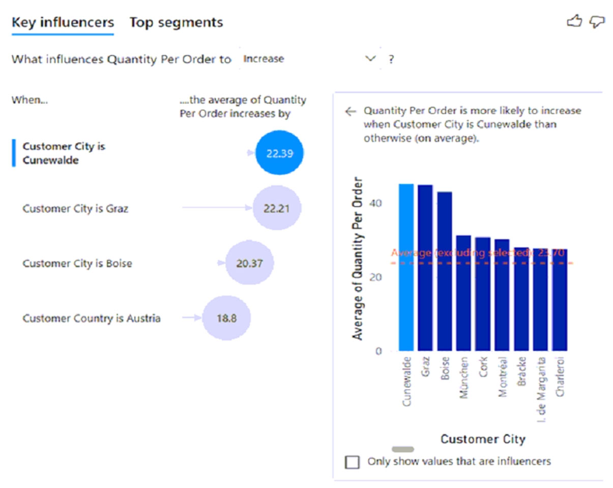
The key influencers visual returns the results shown in the following exhibit.

What can you identify from the visual?
Customers in Austria order 18.8 more units than the average order quantity.
Customers in Boise order 20.37 percent more than the average order quantity.
Product Category positively influences the quantity per order.
Customers in Cork order lower quantities than average.
Answer is Customers in Austria order 18.8 more units than the average order quantity.
Average quantity of units is displayed.
Not B: Average quantity of units is displayed, not percentage.
Reference:
https://docs.microsoft.com/en-us/power-bi/visuals/power-bi-visualization-influencers
You are creating a dashboard by using the Power BI service.
You have an existing report page that contains three charts.
You need to add the charts to the dashboard while maintaining the interactivity between the charts.
What should you do?
Edit interactions in the report and set all interactions to Filter.
Pin each chart as a tile.
Edit the dashboard theme and pin each chart as a tile.
Pin the report page as a live tile.
Answer is Pin the report page as a live tile.
One way to add a new dashboard tile is by pinning an entire report page. This is an easy way to pin more than one visualization at a time. Also, when you pin an entire page, the tiles are live; you can interact with them right there on the dashboard. And changes you make to any of the visualizations back in the report editor, like adding a filter or changing the fields used in the chart, are reflected in the dashboard tile as well.
Pinning live tiles from reports to dashboards is only available in Power BI service (app.powerbi.com).
Reference:
https://docs.microsoft.com/en-us/power-bi/create-reports/service-dashboard-pin-live-tile-from-report
You need to modify a column chart. The solution must ensure that the total for each bar is shown above the column.
What should you enable?
data labels
title
X-axis
Y-axis
Answer is data labels
You plan to use Power BI report visual to display sales values that change over time.
You need to identify a visualization to use. The solution must clearly illustrate the changes of sales values over time.
Which visualization type should you identify?
Column chart
Doughnut chart
Funnel chart
Pie chart
Answer is Column chart
You have a line chart that shows the salary costs of a company over time.
You need to see the employee count when you hover over a data point.
What should you do?
Add employee count to the drillthrough field well.
Add employee count to the small multiples field well.
Add employee count to the tooltips field well.
Add employee count to the visual filters.
Answer is Add employee count to the tooltips field well.
You create a new report.
You need to ensure that users have a good experience when they consume the report on a mobile device.
What are two ways to achieve the goal? Each correct answer presents a complete solution.
Create a mobile report layout in Power BI Desktop and publish the report.
Create a mobile report layout in the Power BI service and save the report.
Navigate to PowerBI.com on a mobile device and test the experience.
Reformat all slicers to have a vertical orientation.
Answers are;
Create a mobile report layout in Power BI Desktop and publish the report.
Navigate to PowerBI.com on a mobile device and test the experience.
Why are parameters important in Power BI paginated reports?
They are required so that Power BI can call the paginated report.
They allow the report developer to control the refresh interval of the report.
They allow the user to control aspects of how the report is rendered when the report is run.
Answer is They allow the user to control aspects of how the report is rendered when the report is run.
Power BI paginated reports are created by using which tool?
Power BI Report Builder
Power BI Desktop
Power BI Service
Answer is Power BI Report Builder
Power BI paginated reports is an evolved technology that was built from which original tool?
SQL Server Analysis Services
Microsoft SharePoint
SQL Server Reporting Services
Answer is SQL Server Reporting Services