PL-300: Microsoft Power BI Data Analyst
Question 171
You have a Power BI report that displays a bar chart and a donut chart on the same page. The bar chart shows the total sales by year and the donut chart shows the total sale by category.
You need to ensure that when you select a year on the bar chart, the donut chart remains unchanged.
What should you do?
Edit the interactions from the Format menu.
Set a visual level filter on the bar chart.
Set a visual level filter on the donut chart.
Add a slicer to the page that uses the year column.
Answer is Edit the interactions from the Format menu.
There are actually three different states for visual interactions in Power BI:
Highlight (the default experience of cross-filtering with shading)
Filter (cross-filtering to show the contextual values only)
None (do not filter)
You can find each by selecting any visual on your report in Power BI Desktop, then go to Visual Tools –> Format -> Edit Interactions.
References:
https://www.excelguru.ca/blog/2016/11/23/visual-interactions-in-power-bi/
You have a Power Pivot model that includes a KPI.
You need to create a visualization based on the Power Pivot model as shown in the exhibit.

Which type of visualization should you use?
matrix
KPI
multi row card
table
Answer is matrix
In a Table we will not have empty lines formatting for Year column.
Reference:
https://www.biinsight.com/use-kpi-in-table-matrix-and-card-visualisations-in-power-bi/#more-4478
You have the report shown in the following exhibit.

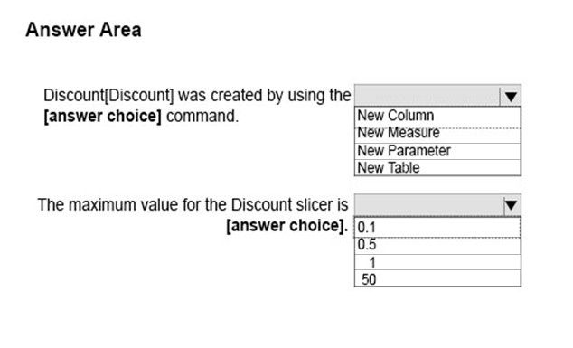
Use the drop-down menus to select the answer choice that completes each statement based on the information presented in the graphic.

Answer is New Parameter and 0,5.
When using New Parameter it automatically creates GENERATESERIES function. Second, in GENERATESERIES function the second parameter is the max value which is 0,5.
You have the visualization shown in the following exhibit.

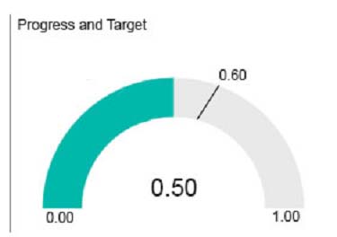
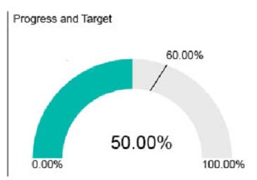
You need to display the values as shown in the following exhibit.

What should you do?
Create a calculated column that adds the % symbol to the values.
From the Modeling tab, change the Data Type to Percentage.
Edit the query of the data source and change the Data Type to Percentage.
Create a measure that adds the % symbol to the values.
Answer is From the Modeling tab, change the Data Type to Percentage.
Go to "Table View" Modeling ribbon tab, change the Data Type to "percentage" and keep 2 decimal.
Reference:
https://docs.microsoft.com/en-us/power-bi/visuals/power-bi-visualization-radial-gauge-charts
You create a KPI visualization in Power BI Desktop that uses the month as the trend axis.
You discover that the data is not sorted by month.
You need to change the sort order of the visualization.
What should you do first?
Convert the visualization to a different type.
Remove the trend axis from the visualization.
Modify the visual level filters.
Modify the drillthrough filters.
Answer is Convert the visualization to a different type.
KPI doesn't have SORT option. You need to start over again.
Converting to different visual type just in order to view the month sequence, and then go to Table View, selecting the month column, and click “Sort by column” under Ribbon Tab “Table Tools”, selecting the “Sort by Month #”, and back to Visual interface, check the result (month(text) sequence), if ok, convert back to KPI visual.
Key Note: Once you convert the visualization to a KPI, there's no option to sort. You must sort it correctly now.
Reference:
https://docs.microsoft.com/en-us/power-bi/visuals/power-bi-visualization-kpi#how-to-create-a-kpi
You are creating a Power BI Desktop report that has several bar charts and a date slicer.
You need to create a slide show that can be viewed from the Power BI service. Each slide must display the charts filtered for a different year.
What should you do before you publish the report?
Configure report level filters, and then create groups that use the List group type.
Configure drillthrough filters for each bar chart, and then select Selection Pane.
Filter the bar charts by using the slicer, and then create bookmarks.
Configure page level filters, and then create groups that use the Bin group type.
Answer is Filter the bar charts by using the slicer, and then create bookmarks.
You can use bookmarks to keep track of your own progress in creating reports (bookmarks are easy to add, delete, and rename) and you can create bookmarks to build a PowerPoint-like presentation that steps through bookmarks in order, thereby telling a story with your report.
References:
https://docs.microsoft.com/en-us/power-bi/desktop-bookmarks
You have three Power BI Desktop projects named Report1.pbix, Report2.pbix, and Report3.pbix that have the following characteristics:
- Report1.pbix contains a custom visualization.
- Report2.pbix implements row level security.
- Report3.pbix connects to a Microsoft SQL Server database by using DirectQuery.
Which reports support Publish to Web, and which reports can be published to Power BI Report Server?

Publish to Web: Report1 and Report3
Reports not supported are based on live connection sources, not DirectQuery ones
Limitations ... "Reports using any Live Connection data source"
https://docs.microsoft.com/en-us/power-bi/collaborate-share/service-publish-to-web#limitations
Power BI Report Server: Report1, Report2 and Report3 (custom visuals are supported, except for R and Python ones, RLS is suported and DirectQuery too
https://docs.microsoft.com/en-us/power-bi/report-server/compare-report-server-service
Power BI Report Server: Row-level security (RLS) is Available in both DirectQuery (data source) & Import mode
You have a Power BI data model that contains the following three tables:
- Sales
- Date
- Product
The Sales table is related to the Date and Product tables by using many-to-one relationships. The Sales table contains a column named Total Sales Amount.
You need to create a measure named Total Sales that can be used in visuals to aggregate Total Sales Amounts by product or by date.
What should you use?
Total Sales = SUM(‘Sales’[Total Sales Amount])
Total Sales = ALL(‘Sales’[Total Sales Amount])
Total Sales = MAX(‘Sales’[Total Sales Amount])
Total Sales = CALCULATE([Total Sales])
You are creating a visualization in a Power BI report. You need to recommend which visualization to use in the report to perform a quick comparison of the current quarter sales by country. Which visualization type should you recommend?
matrix
column chart
scatter chart
gauge chart
You plan to visualize your data using a Word Cloud visual from AppSource.
You need to add the visual to your report page.
What should you do?
From the Visualization Pane, select Get More Visuals.
From the Visualization Pane, select Import a visual from a file.
Add a Python visual to the report page.
Add a Paginated report visual to the report page.