PL-300: Microsoft Power BI Data Analyst
Question 181
You have a report that includes a card visualization.
You need to apply the following conditional formatting to the card while minimizing design effort:
- For values that are greater than or equal to 100, the font of the data label must be dark red.
- For values that are less than 100, the font of the data label must be dark gray.
Which type of format should you use?
Color scale
Rules
Field value
Finding the conditional formatting in the card visual is a bit tricky. There is no separate option for that. You need to go to the Format tab of the visual, and then expand the Data Label. The right beside the Data Label's colour you need to hover your mouse, and you will find a three dots icon appearing, which if you click on it, you will see Conditional Formatting.
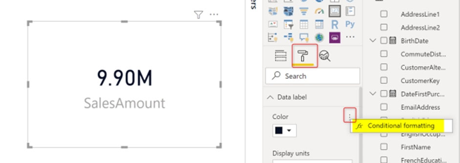
Now in the Conditional Formatting tab, you can apply it in different methods. for example, you can choose Rules, and then
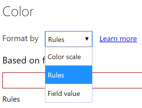
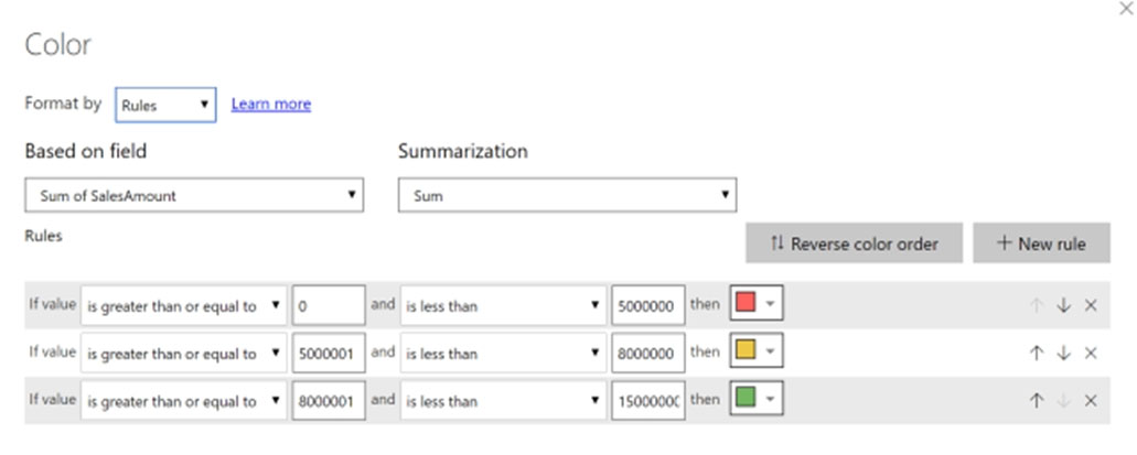
The Rules mode will give you the ability to put custom roles as below;
Reference:
https://radacad.com/enhance-the-card-visual-in-power-bi-with-conditional-formatting
You need to create a visual as shown in the following exhibit.
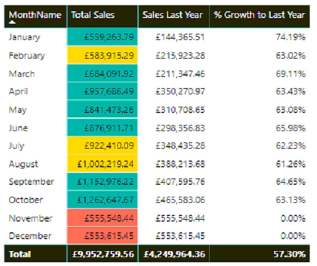
The indicator color for Total Sales will be based on % Growth to Last Year.
The solution must use the existing calculations only.
How should you configure the visual?
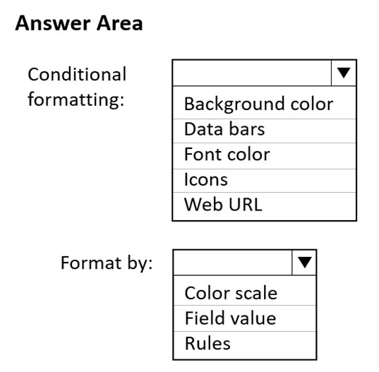
Check the answer section
Answer is Background color
Rules
the existing calculation refers to the measure "% Growth to Last Year" and not about an extra column with the color name
Reference:
https://docs.microsoft.com/en-us/power-bi/create-reports/desktop-conditional-table-formatting
You have a Microsoft Power BI report that contains two pages. The first page contains a clustered bar chart.
You plan to configure the clustered bar chart to use the second page as a tooltip report.
What should be done on the second page?
The Allow Q&A setting must be enabled.
The Allow use as tooltip setting must be enabled.
The canvas background transparency must be set to 100%.
The Canvas setting must be set to Tooltip. -
Answer is The Allow use as tooltip setting must be enabled.
You create a Microsoft Power BI report that will be accessed by hundreds of users on their laptops. The report contains one page. The page size is set to the custom dimensions of 2500 x 3500.
You set Page view to Actual size and publish the report to the Power BI service.
What is the resulting user experience?
a page background image with a misconfigured aspect ratio
a page that requires users to interact with scrollbars to view the entire page
a page that requires users to zoom out to read the visuals
a page with a large area of wallpaper shown at the bottom of the page
Answer is a page that requires users to interact with scrollbars to view the entire page
You have a Power BI report that contains a clustered column chart visual. The visual shows the revenue on the y-axis and the month on the x-axis.
You need to ensure that users can drill down from month to week to day.
To what should you add the Week and Day fields?
Legend
Small Multiples
X-axis
Y-axis
Answer is X-axis
You have a report that contains a bar chart and a pie chart. The interactions use the default settings.
You need to ensure that when you select a bar, the pie chart redraws showing only the data related to the bar.
You enable Edit Interactions.
What should you do next?
Select the pie chart and set the bar chart interaction to Filter.
Select the pie chart and set the bar chart interaction to None.
Select the bar chart and set the pie chart interaction to Filter.
Select the bar chart and set the pie chart interaction to None.
Answer is Select the bar chart and set the pie chart interaction to Filter.
You plan to analyze sales data in Power BI by using the following fields:
• Sales amount
• Order Quantity
• Product
You need to use clustering to identify groups of similar data points in a subset of your data.
What visualization type should you use?
Line chart
Scatter chart
Tree map
Waterfall chart
Answer is Tree map
You are reviewing the attendance data for a school in a Power BI report. The report contains a bar chart that shows the average attendance by grade.
You need to analyze the causes for different attendance across grades. The solution must NOT add a new visual to the page.
What feature should you use?
Analyze: Find where this distribution is different
Find anomalies
Spotlight
Summarize
Answer is Spotlight
What is a dashboard?
A canvas of report elements that can be built in Power BI desktop.
Dashboards can be built by using visuals that are developed with an underlying data source.
A canvas of report elements that can be built in the Power BI service.
The canvas in which you can view the data model of a report.
Answer is A canvas of report elements that can be built in the Power BI service.
What is one way that reports and dashboards differ?
In reports, you can have multiple pages; in dashboards, you can have only one page.
In reports, you can use the slicers and filter by selecting a data point on a visual; in dashboards, you can only filter a dashboard tile in focus mode, but can't save the filter.
You can only build reports and dashboards in Power BI service.
They are the same.
Answer is In reports, you can have multiple pages; in dashboards, you can have only one page.